How to Design a Better Medical Device User Interface

A great medical device user interface doesn’t just look good—it keeps users safe, supports critical decision-making, and reduces risk in high-stakes environments. Whether your device lives in a hospital, clinic, or a patient’s home, the interface is often the difference between confidence and confusion.
At Kablooe, we’ve spent more than 30 years designing medical devices where user interface design for medical devices directly impacts outcomes. Along the way, we’ve learned that great interfaces don’t happen by accident. They emerge from intentional design processes that blend creativity, engineering discipline, and human factors expertise.
Why Medical Device User Interface Design Matters More Than Ever
Medical devices operate in complex environments where mistakes carry real consequences. If a user misinterprets a display, misunderstands a control, or can’t find critical information quickly, patient safety is at risk.
Strong medical device user interface design helps:
- Reduce cognitive load for users
- Support fast, accurate decision-making
- Prevent use errors before they occur
- Address regulatory and human factors expectations
- Improve user adoption and long-term satisfaction
In short, your interface isn’t decoration—it’s a safety feature.
Key Takeaways for Better Medical Device User Interface Design
Designing an effective medical device user interface requires more than clean visuals—it demands a thoughtful balance of usability, safety, and system-level thinking. Here’s what matters most:
- Start with function, not screens. Understand the device’s core purpose and functional characteristics before designing layouts or interactions.
- Use use-related risk analysis early. Identify potential user errors upfront and design the interface to actively prevent them.
- Make critical information easy to find. Strong information architecture and labeling are essential—especially in stressful or time-sensitive situations.
- Explore multiple concepts before committing. Balance creativity with engineering rigor by evaluating many interface ideas early, not just the first good one.
- Rely on proven UI fundamentals. Affordance, feedback, consistency, and recovery remain non-negotiable in medical device user interface design.
- Design the entire ecosystem. Consider how the interface works across connected devices, companion apps, and data platforms—not just a single screen.
- Test in the real world. Validate the interface in realistic environments with real users to uncover risks and usability gaps before launch.
Below, we break down the principles, practices, and mindsets that lead to better medical device user interface design—and how your team can apply them to reduce risk, improve usability, and accelerate adoption.
1. Start by Understanding the Functional Characteristics of Your Medical Device
Before sketching screens or defining layouts, your team must understand the functional characteristics of medical device systems. Functional characteristics define the rules the user interface must follow to ensure safety, clarity, and predictable performance in real-world use.
In the context of medical device user interface design, functional characteristics typically include:
- Response time expectations: How quickly the interface must react to user inputs, especially during critical tasks or alarms.
- Alert priority rules: How alerts are categorized, escalated, silenced, or overridden—so users immediately understand what requires action now versus later.
- Data refresh frequency and accuracy: How often data updates, how precise it must be, and how stale or missing data is communicated to the user.
- Failure states and safe modes: What the interface shows when something goes wrong, and how it guides the user into a safe, recoverable state.
- Required user confirmations: When the system should slow users down with confirmations—and when it should not—to prevent unintended actions without creating friction.
- Workflow dependencies: How one action or screen depends on another, and how the UI prevents users from skipping critical steps or completing tasks out of sequence.
Understanding these functional characteristics early helps ensure the user interface reinforces correct use, supports safe decision-making, and aligns with use-related risk analysis and regulatory expectations—before visual design ever begins.
Key questions to answer early:
- What information is mission-critical vs. secondary?
- When does the user need feedback—and how fast?
- What actions must be unmistakably clear?
- What happens if the user makes a mistake?
A strong interface reflects the device’s functional priorities, not just its technical capabilities.
2. Design with Use-Related Risk Analysis in Mind
One of the most common mistakes in medical device user interface design is treating usability as a “later” concern. In reality, usability and safety are inseparable. By identifying risks early, interface design can actively prevent them—rather than relying on training or warnings to compensate.
A common use-related risk in medical device user interface design isn’t device failure—it’s delay. When critical controls are buried in secondary menus, visually minimized, or inconsistently labeled, users can lose valuable time searching for the right action, especially in high-stress situations. Through use-related risk analysis, these issues often surface when interfaces are tested in realistic scenarios rather than ideal conditions.
Addressing the risk early allows teams to elevate high-priority controls, introduce intuitive shortcuts, and standardize control placement, reducing cognitive load and time to action. The result is a user interface that actively improves safety by helping users act quickly and confidently when it matters most.
Effective use-related risk analysis considers:
- Likely user errors (not just ideal usage)
- Environmental factors (lighting, noise, stress, etc.)
- User experience levels (trained clinicians vs. first-time patients)
- Consequences of incorrect inputs or missed alerts
Use-related risk analysis should inform interface decisions from day one—not after the design is already locked.
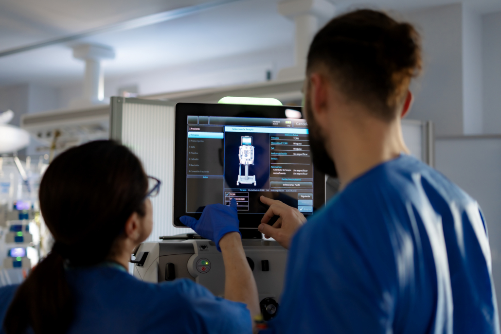
3 . Implement Clear & Consistent Information Architecture Labeling
A clean interface means nothing if users can’t find what they need. That’s where information architecture labeling becomes critical. Effective labeling ensures terminology matches user expectations, controls are grouped logically, navigation supports task flow, and information hierarchy reflects urgency and importance.
Best practices for information architecture labeling:
- Use plain language over technical jargon
- Keep labels consistent across screens
- Avoid abbreviations unless they’re universally understood
- Test labels with real users—not internal teams
Thoughtful information architecture reduces hesitation, speeds task completion, and lowers the chance of dangerous mistakes.
4. Think Like a Designer and an Engineer
Great interfaces live at the intersection of creativity and logic. At Kablooe, we often say the best outcomes happen when teams think like designers and engineers simultaneously.

This mindset helps teams:
- Explore multiple interface concepts early
- Balance innovation with regulatory realities
- Avoid falling in love with the first solution
- Design systems that scale technically and visually
Creative exploration isn’t about chaos—it’s about uncovering better solutions before constraints narrow the field.
5. Use Creative Processes—Intentionally
Creativity doesn’t mean a lack of structure. In fact, the best interface teams rely on repeatable processes that encourage divergent thinking before convergence.
Techniques we use regularly:
- Warm-up exercises before ideation sessions
- Generating multiple interface concepts per feature
- Sketching workflows, not just screens
- Combining elements from multiple concepts into a final solution
This approach ensures the final interface is informed by many ideas—not limited by the first one.
6. Remember That Affordance, Feedback, and Consistency Still Matter
While tools and technologies evolve, certain user interface design for medical devices principles never go out of style.
Non-negotiable UI fundamentals:
- Affordance: Controls should visually suggest how they’re used
- Feedback: Users must always know the system’s status
- Consistency: Patterns should behave the same across screens
- Recovery: Users should be able to undo or correct actions
These principles aren’t just about polish—they directly impact safety and usability.
7. Ensure Your Device is Properly Connected
As more medical devices become connected, new UI challenges emerge. By understanding the unique needs of connected device users, you can build interfaces that not only delight but also simplify complex tasks, enhance engagement, and deliver on the promise of innovation. Check out our UI/UX Design Guide to learn more.
Interfaces must now support:
- Data synchronization
- Remote monitoring
- Multi-platform experiences (device + app + web)
- Security and access control considerations
Designing a medical device user interface today often means designing an ecosystem—not a single screen.
8. Design for the Real World, Not the Ideal One
Real users don’t behave like test cases. They’re distracted, rushed, tired, stressed, or unfamiliar with the device. Great medical device user interface design anticipates this reality.
That means:
- Designing for edge cases, not just success paths
- Testing interfaces in realistic environments
- Validating assumptions with real users early
- Letting usability findings drive refinement
The goal isn’t perfection—it’s resilience.
What World-Class Medical Device UI Looks Like
At its best, a medical device interface:
- Feels intuitive without instruction
- Reduces user stress
- Supports safe, confident decision-making
- Aligns with regulatory expectations
- Scales as the product evolves
At Kablooe, that’s the standard we aim for on every project. See how we define world-class design.
Ready to Improve Your Medical Device User Interface?
If your interface feels cluttered, confusing, or risky—or if you’re designing a new device from the ground up—it may be time to rethink your approach.
At Kablooe, we design medical device user interfaces that balance creativity, engineering rigor, and human factors insight—so your product works when it matters most.
Reach out today and let’s talk about designing an interface your users can trust.
Medical Device UI Design FAQs
What makes a medical device user interface “safe”?
A safe medical device user interface enables users to complete critical tasks correctly the first time—even under stress, fatigue, or distraction. It makes the right actions obvious, presents the most important information at the right moment, and provides clear feedback so users always understand the device state and next steps. A well-designed UI also anticipates predictable use errors and reduces the likelihood of harm through smart defaults, confirmation for high-risk actions, and clear recovery paths when something goes wrong.
What are the most common medical device UI design mistakes?
Most UI failures fall into three categories: unclear priorities, inconsistent patterns, and weak error prevention. Common examples include burying mission-critical information, overwhelming users with alarms or visual noise, inconsistent navigation or terminology across screens, ambiguous units or inputs, and relying on warnings or training instead of designing the interface to prevent errors in the first place.
How do you reduce cognitive load in clinical interfaces?
Cognitive load is reduced by showing only what’s needed for the task at hand—and presenting it in a predictable, structured way. Strong visual hierarchy helps users quickly identify key values and actions, while grouping related controls and maintaining consistency across screens minimizes mental effort. Progressive disclosure keeps advanced options available without overwhelming routine workflows, and clear system feedback ensures users never have to guess what the device is doing.
When should usability testing happen in medical device UI design?
Usability testing should start early and continue throughout development. Low-fidelity concepts and workflows can be tested before visual design is finalized, allowing teams to validate information architecture, labeling, and task flow while changes are still easy and cost-effective. As the design matures, higher-fidelity prototypes and real-world context-of-use testing help uncover issues related to environment, stress, and edge cases—long before they become risks in the field.


